ALL-IN-ONE WALLET
ALL FOR YOU
CLIENT /
Google Wallet
ROLE /
Concept + Creative Direction,
Art Direction, Design Lead, Illustration, Storyboards + Motion Direction
SCOPE /
How-to & Explainer Videos
06

THE CHALLENGE / AN AESTHETIC EVOLUTION
Following a comprehensive app redesign, Google Wallet’s existing how-to library required a visual refresh to align with the new product identity. The legacy content had begun to feel aesthetically dated, utilizing an overly detailed visual style that no longer matched the sleek, modern direction of the brand. For a high-utility platform, it was essential that the instructional content aesthetically aligned with the app itself to maintain a cohesive user experience.
I was tasked with developing a modern, sleek visual language for a suite of how-to and explainer videos. This system needed to be highly scalable to support global localization efforts across 30+ markets while remaining accessible to both power users and first-time adopters.


ART DIRECTION & SYSTEM LOGIC / STRATEGIC SIMPLIFICATION
My approach focused on a total aesthetic shift from dated realism to platform-agnostic modernism. I implemented a "Reduction and Elevation" framework: intentionally stripping away non-essential UI elements to lower the cognitive load. By removing "instructional noise" and hardware-specific markers like the Android frame, we allowed the user to focus entirely on the next step. This strategy ensured the content remained timeless, focused, and easily scalable for global rollout.
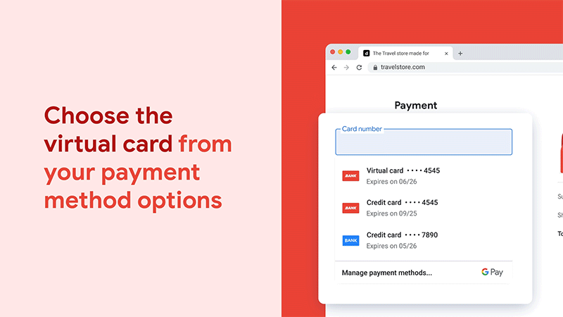
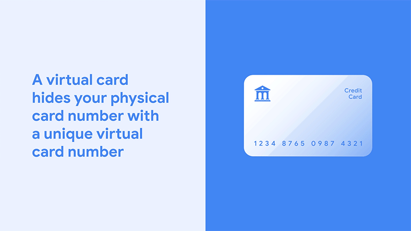
To define the new visual language, I conceptualized the "Monochromatic Moment." This style replaced clinical white backgrounds with vibrant, flooded brand colors, utilizing varying intensities of the core palette to create depth while strictly adhering to Google’s brand governance. We adopted a blue-first hierarchy for the how-to videos, aligning with the brand guideline that prioritizes Google Blue as the paramount color for all design choices. The remaining brand colors were reserved for the more complex explainer videos, creating a clear visual taxonomy that distinguished quick utility from deeper education.


HOW-TO & EXPLAINER VIDEOS


IMPACT / EXECUTION AND MORE
The result was a robust, scalable video system that has generated over 900,000 combined views and became the global standard for Google Wallet education. By developing a comprehensive production framework and overseeing a team of designers, I ensured the Monochromatic logic remained consistent across more than 30 localized assets.
This design system now operates seamlessly across the global ecosystem, including Google Help Center articles, the official YouTube channel, the Google Wallet site, and social media promotions.

Travis Taylor –– COPY
Amy Rexford –– DESIGN/ILLUSTRATION
Randy Rentera –– PRODUCTION DESIGN
Zahra Fardin –– ILLUSTRATION
Sean Thompson –– MOTION DESIGN
Rob Neno –– MOTION DESIGN
Tomi Rosanwo –– ART DIRECTION/CONCEPT, DESIGN LEAD, ILLUSTRATION